Sunday, November 29, 2009

DANIEL BURNHAM.The Edison Building.......... In the Details

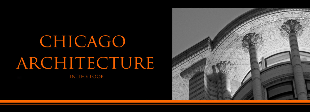
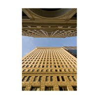
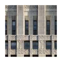
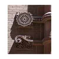
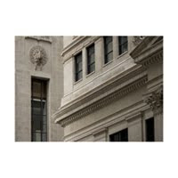
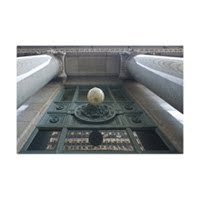
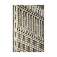
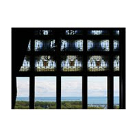
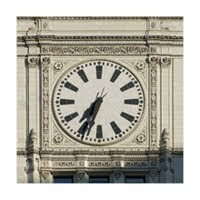
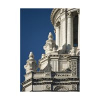
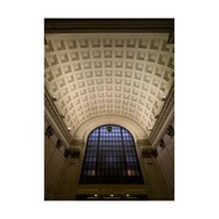
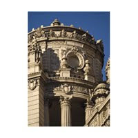
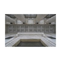
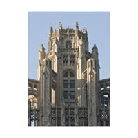
Discussing the variation of theory and reason in Architecture sometimes needs to take backseat to the Architecture itself.    I saw a nasty confrontation on Facebook yesterday between Modernists and Contextualists. (Arghhhhhh -- "The Idiots")   And so today, there is no theory. Only pictures.  Details in stone -- that once generated angry discussion, a not-so-subtle play of politics, un-ending argument, alcoholism, loss, vicious victory (really vicious), and envy -- will today present themselves as simple shape and light, softened with the patina of the century.


Mies said "God is in the Details."  Surely he is mistaken.  Surely, it is the Devil.

Saturday, November 21, 2009

DANIEL BURNHAM. The Edison Building. Variations on a Theme

A Play in Five Acts. A Sonnet with patterned rhythm and rhyme. Both allow creativity within a framework. And Variations on a Theme.

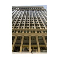
The Edison Building is immediately recognizable as a Daniel Burnham Building. Tripartite Design. Classic Details. Monumental Cornice. And home to an important turn-of-the-century Chicago corporation. What is not so obvious to the modern eye, are the variances from one Burnham building to the other. In this case a piano nobile rests on a simple base, not on the ground. Corinthian Columns, flattened at the solid corners support a continuous lintel. Office windows span each bay in groups of threes. The loggia is arched; the Building's surface heavily textured. Each decision was consciously made.


These kinds of arbitrary aesthetic decisions seem foreign to us. Until we look across the street, and attempt to recreate the historical precedents that surround Mies' late mid-century Federal Center, or attempt to follow the decision process that wrapped a steel H-section in layers of fireproofing and cladding to mimmick cladding and structure. Or conclude that black was the only appropriate building color.

The design processes, including the arbitrary decisions made in the name of the current definition of "beauty", remain fundamentally the same.

.


The Edison Building has been much changed. Its towering loggia is now dwarfed by surrounding buildings. The original banking room is gone. And the cornice. And a black band (that once housed a snow-melting heatlamp) wraps the building at the base of the columns. Some column piers have been reduced or relocated. Still, enough remains to give a good sense of what the Building once was -- and what the 1905 definition of "beauty" might have included. Use these links for an historic look at the first floor COLUMN BASE and the ORIGINAL CORNICE.

Laughing, even at myself, I have to admit that Mies was right. "God is in the Details, " he said. I'll be presenting additional details from the Edison Building in future posts.

FOR ADDITIONAL PHOTOS OF CHICAGO'S ARCHITECTURE, VISIT IMAGES IN THE LOOP.

Wednesday, November 18, 2009

DANIEL BURNHAM. The Edison Building Patterns and the Play of light


I can't shake it.

I keep hearing the echoes of last week's CAF tour guide pointing at the the Art Institute of Chicago, and mumbling something about how bose- zarts has nothing original. Nothing creative.

Below are ornamental patterns from the Conway Building (1913), People's Gas (1910) and the Commonnwealth Edison Building (1905), all designed by D.H. Burnham and Company. The range of pattern is remarkable. Especially when considered that they are used consistently on the intermediate shaft of all three buildings.

I have to wonder if these complex patterns were most important in the designer's mind -- or if the play of light across their complex geometries and its effect on each building as a whole was the raison d'etre.

.

COMMONWEALTH EDISON (above)

PEOPLES GAS (below)

THE CONWAY BUILDING (ABOVE)

.
Daniel Burnham's raison in 1905 was the Plan of Manila. Daniel was about to make it......big time. For the second time. And Peirce Anderson was earning his position as partner in charge of design. Anderson's design influence on the firm becomes unmistakable during this period. Commonwealth Edison clearly bears his signature.


FOR MORE PHOTOGRAPHS OF CHICAGO'S ICONIC ARCHITECTURE VISIT IMAGES IN THE LOOP.

Tuesday, November 17, 2009

DANIEL BURNHAM. The Edison Building . A Question of Timing

The 20 storey building at 135 South Clark began life as the Commer-cial National Bank. Later it became the Edison Building. It is now the Board of Education. Thomas Hines dates the building to 1905. As does Kristin Schaffer. Frank Randall dates it to 1907, as does the usually reliable Emporis. My well-worn copy of the AIA Guide to Chicago leaves their map blank and provides no information. (A sign of utter distaste). For the purposes of this and the next few posts I will refer to this structure as the Edison Building.

The discrepancy of construction dates is not unusual. Even in a City that says it loves its architecture. It is, however, remarkable for this building: the Edison Building is one of eighteen remaining structures in the Loop designed by D.H. Burnham and Company. Chronologically it falls between Orchestra Hall (1905) and the Field Museum (begun in 1909).
.

.
Despite significant alterations and condition issues, it is an excellent example of Burnham's early Twentieth Century Work. Its tripartite design and attention to detailed ornament are in the Beaux-Arts tradition of People's Gas and The Conway Building.
.
TO SEE ADDITIONAL PHOTOGRAPHY OF CHICAGO'S ARCHITECTURAL ICONS VISIT IMAGES IN THE LOOP.

Wednesday, November 11, 2009

CHICAGO. Architectural Theory

I visited the Auditorium this week and toured the Theatre with one of Roosevelt's very knowledgeable docents. The sixth floor balcony system, partially suspended and entirely separable from the rest of the Theatre is a remarkable piece of engineering. And for me, it was new knowledge. Also new knowledge was the fact that Mr. Form-Follows-Function, our Hometown-Hero Louis Sullivan had applied FAKE ARCHES to the ceiling of the Theatre. It was as if I had discovered that there was no Santa Claus....... FAKE ARCHES.

Today, on a Chicago Architectural Foundation Tour, I learned that Daniel Burnham ("who was a businessman but not a real architect") faked his Beaux Arts Columns. (eg. there was "steel inside." And of course, that was BAD. (Though Sullivan remained GOOD) And then in rapid fire repartee I learned that there was nothing original about the Beaux Arts facade of the Art Institute. Nothing. "You can find buildings like that all over Europe." (BAD) Could it possibly be that our arbiteurs of good taste had made a mistake?

This isn't the first time I've run into this kind of conceptual/historical architectural dissonance. But perhaps with the attachment of the Anti-abortion Amendment to the Health Care Debate and the newfound, heartfelt remorse over our failure to rescue Bear Stearns I have less patience with re-written history and mindless opinion.

At least in Chicago, at least with Architecture, we have what we have and it is all good. Louis Sullivan's glittering arches (structureless though they may be) glitter with a young mind's early attempt with original ornament. Daniel Burnham's penchant for the Beaux Arts resulted in his trust for Peirce Anderson and the stunning row of Ionic Columns at the base of People's Gas. (Not to mention the Field Museum) Frank Lloyd Wright remade Oak Park. Prairie School. Bauhaus. Beaux Arts. Modernism. These are not Oppositions. They are each and all coin in our hands. To be treasured. Respected.

The Restoration of Board of Education Building and the Preservation of Michael Reese are not unrelated issues pursued by opposing forces. And Albert Fleury's classic allegory above the proscenium of Louis Sullivan's stunning stage represents perfect Unity.
.

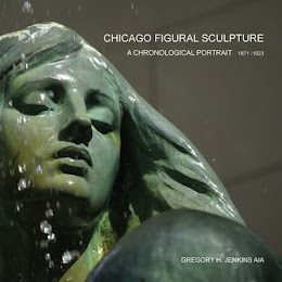
I've received a couple of notes asking about the slowing of posts to this blog. Apologies are due. But it is also with great pride that I will shortly be announcing the publication of CHICAGO FIGURAL SCULPTURE. Volume I 1871 thru 1923 -- which has taken more time than I could have ever imagined. Take a look, too, at the new photography presentations at Images in the Loop.

On a lighter note, on today's CAF Tour I met DESIGNSLINGER -- in person. And would like to take this opportunity to again recommend their work, with best wishes from CHICAGO AND POINTS NORTH.

Next week, we'll be back on message, with a review of the Com Ed Building.

TO SEE ADDITIONAL PHOTOS OF CHICAGO ICONS VISIT IMAGES IN THE LOOP